10 Elegant Font Pairings for Solopreneurs
Introduction
Crafting Your Solo Business Voice: The Power of Elegant Font Pairings
The Significance of Your Selection
For solopreneurs, establishing a strong visual identity is not just about aesthetics; it’s about communication. Selecting the right font pairings for solo businesses can significantly enhance this communication.
Elegant font pairing not only complement your business’s visual motif but also reinforce the uniqueness of your business style. In this exploration, I focus on free Google Font pairings that bridge the gap between modern sophistication and timeless elegance, providing an ideal toolkit for solopreneurs aiming to articulate their business’s essence visually.
Table of post content
Before You Start: Font Pairings for Solopreneurs Foundation
The Beauty of Typography: Typefaces, Fonts, and Their Impact
Let’s set the stage before delving into elegant font pairings for solopreneurs selection.
Typography, typefaces, and fonts – while these terms are often used interchangeably, understanding their nuances is crucial for us solopreneurs.
Typography is the art of arranging type to make the language legible, and readable. Typefaces are the designs of the lettering which comprise styles and characters, giving a distinctive look.
Fonts, the digital or physical embodiment of typefaces, are what we use to convey our solo business’s mofit.
In this post, I’ll refer to typefaces as fonts for clarity.
Elegant Font Pairing for Commercial Use
For solo businesses, font licensing can be a minefield. However, Google Fonts presents a goldmine of opportunities, offering elegant font combinations for commercial use at no cost.
These fonts are open-source, meaning they can be used freely across various platforms—from printed materials and websites to product packaging—without incurring licensing fees.
Additionally, Google Fonts supports a wide range of languages, making them a versatile choice for global solo businesses. Check font compatibility with your language using Google Fonts’ language filter by visiting fonts.google.com.
This accessibility and flexibility underscore why choosing the right font from Google Fonts can be a pivotal step in aligning your visual communication with your business motif.
Mirror Your Motif: Refining Solo Business with Elegant Font Pairing
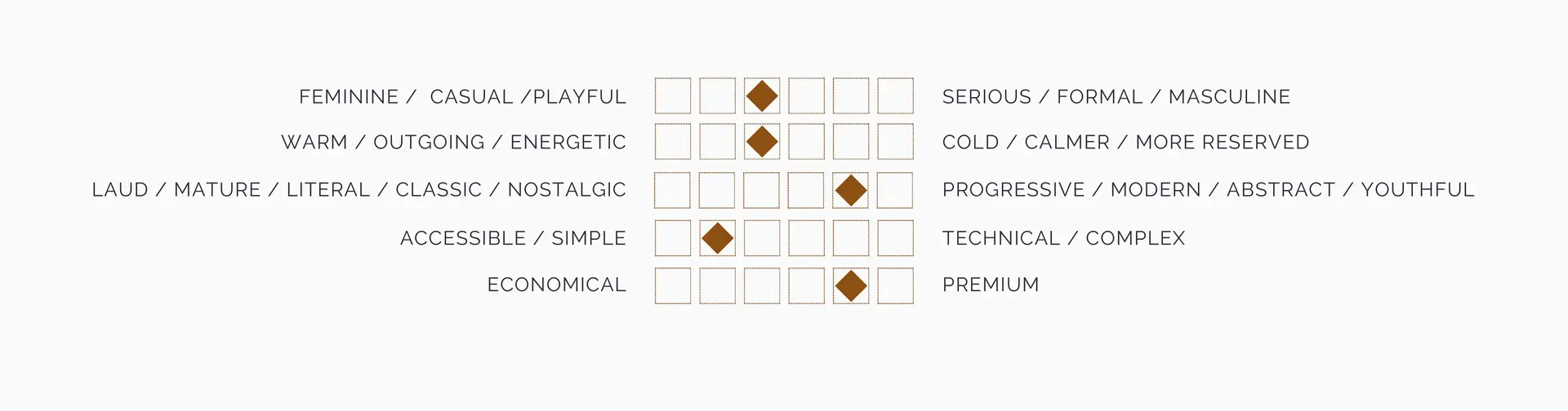
The essence of your solo business is its heartbeat. Before selecting your fonts, take a moment to reflect on the adjectives that define your business’s motif.
Are you aiming for an approach that’s feminine, playful, or perhaps more serious and formal? Fonts are powerful tools in highlighting these motifs, enabling solopreneurs to project their unique tone and personality through visual design.
Choosing a font that aligns with your business’s core attributes ensures that your branding speaks directly to your targeted audience, resonating with them on a nuanced level.
Please refer to this cheat sheet to guide your reflection on the tone of your solo business.
Consistency in Design: Extending Your Elegant Font Choices Across Channels
For a cohesive visual identity, limiting your font pairings to two or three choices is advisable—one for headings, one for body text, and possibly another for sub-headings or accents.
While my post emphasizes selecting fonts for your website, consistency across all communication channels is paramount.
Whether for your social media profiles, business cards, or promotional materials, maintaining a uniform font usage strengthens your brand recognition, making your solo business instantly identifiable across various mediums.
4 Elegant Font Pairings that express pure sophistication
Antic Didone (headings) & Antic Didone (body). A Duet of Elegance and Grace
Embrace timeless elegance with Antic Didone, a typeface that seamlessly combines classic serif elements with modern didone characteristics. The distinct contrast between thick and thin strokes, coupled with bold vertical lines, radiates sophistication.
Whether used for headings or body text, Antic Didone will elevate your website with its enduring charm.
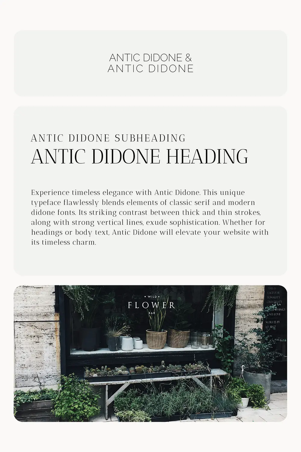
- Herbal apothecary: Perfect for businesses focused on herbal remedies and natural wellness products, combining tradition with a sleek, modern presentation.
- A life coaching service offering affordable guidance and support for personal growth and self-improvement.
- A solo business helping individuals declutter and find harmony in their homes and lives.
- A nutrition and wellness blog providing practical tips and recipes for maintaining a healthy lifestyle on a budget.
- A boutique bakery offering artisanal pastries and custom cakes for special occasions.
Consider these examples of solo businesses that could benefit from this elegant font pairing to enhance their brand motif:
Halant (headings) & Raleway (body). Striking the Perfect Balance of Modern Sophistication
Discover the art of subtlety and grace with the harmonious pairing of Halant and Raleway. Halant exudes elegance and sophistication with its refined letterforms, making it a perfect choice for captivating headings.
Complementing its timeless charm is Raleway, a versatile and legible font. Together, Halant and Raleway create a subtle yet captivating combination, gracefully guiding readers through your content with style and clarity.
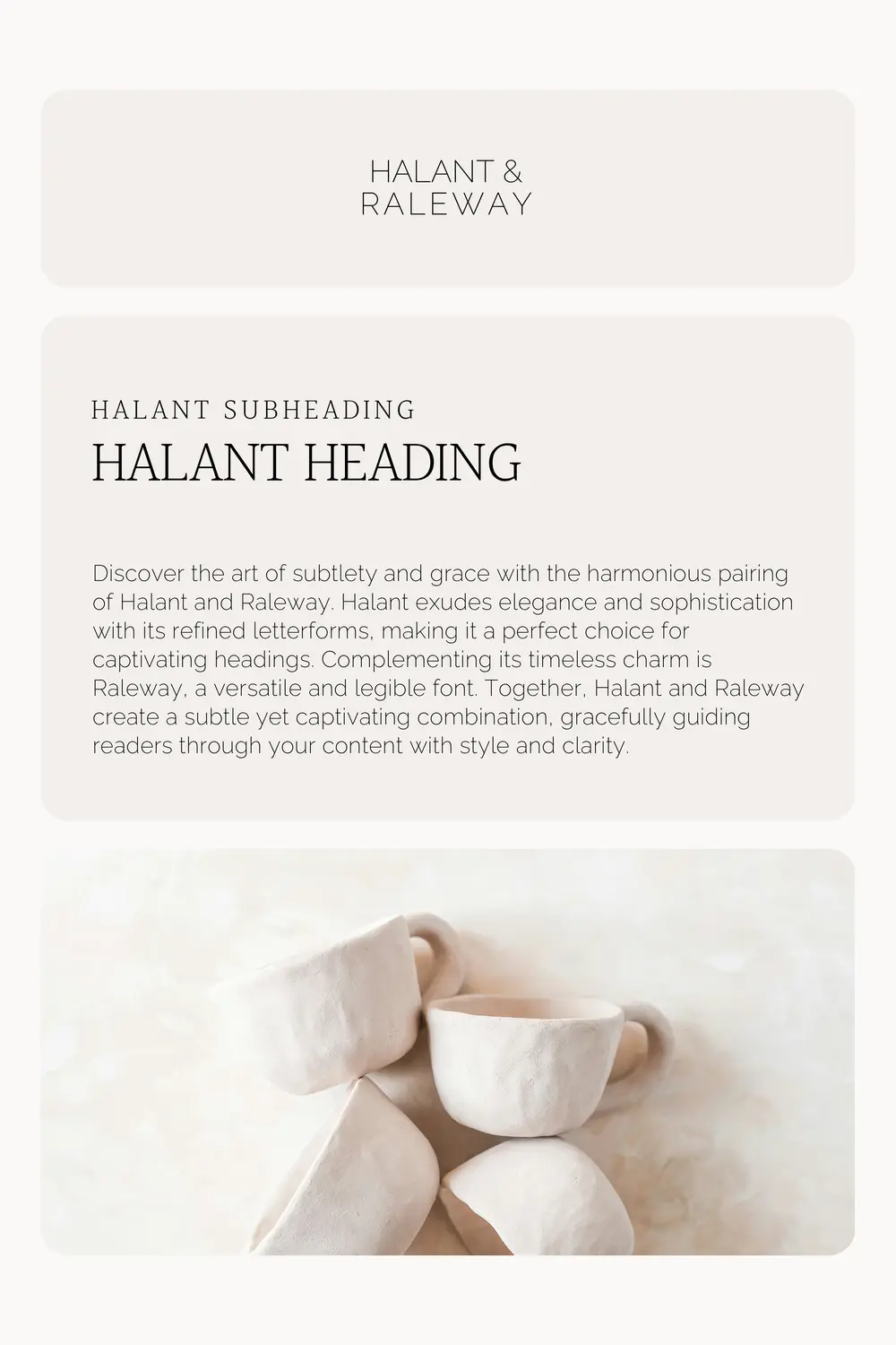
- Mindfulness Coach or Yoga Instructor: The combination of Halant and Raleway offers a serene and accessible appearance, suitable for professionals dedicated to teaching mindfulness and yoga.
- Freelance Writing Services: For writers offering content creation, blogging, or editorial services, this combo sets a tone of reliability with a modern edge.
- Educational Tutoring Services: Perfect for tutors or educators who provide personalized learning experiences, blending approachability with expertise.
- A life coach providing guidance and support to individuals seeking personal growth.
Consider these examples of solo businesses that could benefit from this elegant font pairing to enhance their brand motif:
Forum (headings) & Cormorant Garamond (body). A Regal Blend of Tradition and Grace
Elevate your designs with the perfect font duo of Forum and Cormorant Garamond. Forum effortlessly balances elegance and readability, with refined curves and timeless appeal. Meanwhile, Cormorant Garamond embodies tradition and grace, with graceful letterforms and delicate serifs that capture the essence of timeless typography. Together, these fonts create a harmonious blend of style and legibility, making them a great elegant font pairing for projects that demand both beauty and readability.
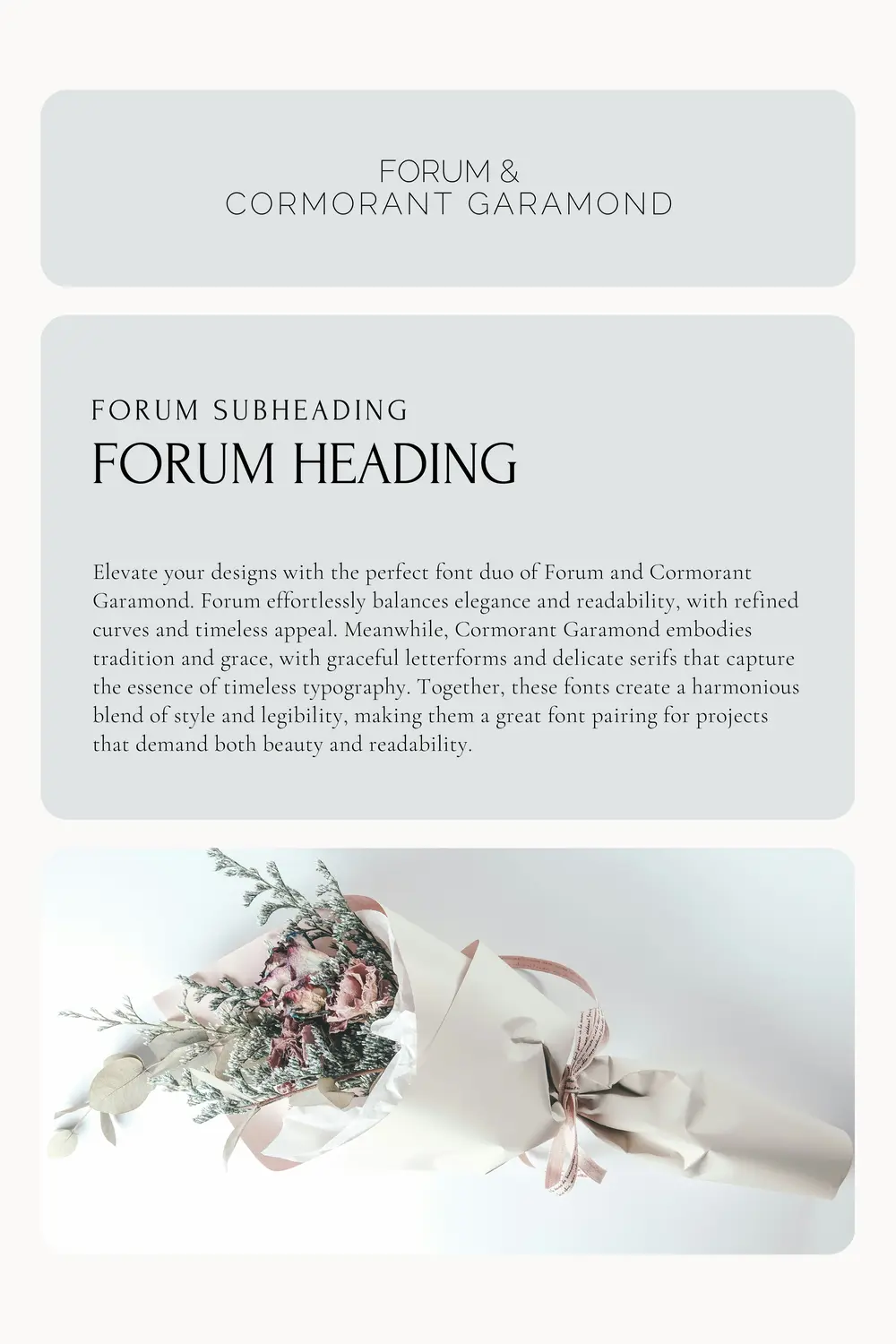
- Vintage Boutique or Curator: This pairing speaks to businesses with a flair for history and nostalgia, perfect for a boutique specialising in vintage finds or curated collections.
- Wedding Planner: For planners that aim for an air of romantic elegance in their service presentation, this combination offers a timeless appeal.
- Antique Book Expert: Ideal for the sophisticated nuances of rare book dealing, exuding a classic elegance that appeals to collectors and enthusiasts.
- Classical Musician or Instructor: Offers a refined and cultured look, suitable for professionals in the classical music industry, from performers to teachers.
Consider these examples of solo businesses that could benefit from this elegant font pairing to enhance their brand motif:
Taviraj (headings) & Taviraj (body). Embracing Contemporary Elegance with a Touch of Warmth
Experience elegance and subtlety with the Taviraj font pairing. Taviraj, with its delicate and graceful curves, is perfect for headings, commanding attention effortlessly. As a body font, it offers clarity and legibility, providing a smooth reading experience. The Taviraj font pairing strikes a balance between sophistication and subtlety, elevating your website design with its refined aesthetic.

- Personal Branding Consultant: This pairing suits consultants who aid individuals in crafting and expressing their personal brands, offering a balance between modernity and tradition.
- Photography Studio: Especially suitable for photographers with a focus on portraits or weddings, combining modern elegance with a touch of warmth.
- Luxury Handmade Goods: For businesses specializing in handcrafted items, Taviraj provides an elegant and bespoke feel.
- Culinary Blogger: This font pairing is appetizing for culinary enthusiasts sharing gourmet experiences or recipes, blending modern flair with a taste for tradition.
- A yoga studio offering accessible and affordable classes for individuals of all ages and fitness levels.
Consider these examples of solo businesses that could benefit from this elegant font pairing to enhance their brand motif:
Grace With Classic Appeal: 3 Timeless Elegant Font Pairings
Cormorant Garamond (heading) & Lato (body): An Alliance of Classic Beauty and Readability
Indulge in a typographic symphony with the harmonious duo of Cormorant Garamond and Lato. Cormorant Garamond stands as an epitome of timeless elegance with its graceful letterforms and delicate serifs, making it a perfect choice for headings. Paired with Lato, a versatile and highly readable font for body text, this combination ensures that your content maintains both clarity and legibility without compromising style. The amalgamation of Cormorant Garamond and Lato lends an aura of sophistication to any design, seamlessly blending readability and aesthetics.

- Literary Agent or Editor: Professional yet approachable, this font pairing is ideal for literary professionals who balance the classic art of storytelling with modern publishing demands.
- Personal Development Coach: For coaches focusing on life, career, or personal growth, offering a sophisticated but accessible vibe.
- Environmental Blogger or Advocate: Combines an authoritative voice with modern clarity, suitable for discussing environmental issues and sustainable living.
- A personal development blog offering practical advice and resources for self-improvement on a budget.
- A wedding planning service specializing in creating elegant and affordable weddings for couples on a budget.
Consider these examples of solo businesses that could benefit from this elegant font pairing to enhance their brand motif:
Lora (heading) & Alegreya Sans (body): A Harmonious Blend of Tradition and Modernity
Experience the perfect fusion of elegance and readability with the impeccable pairing of Lora and Alegreya Sans. Lora, with its bold and expressive serifs, makes a striking statement as a heading font, while Alegreya Sans offers a clean and modern look for body text. The graceful curves and precise details of Lora evoke a sense of timeless sophistication, while Alegreya Sans ensures an effortless reading experience for your website visitors. These fonts work in harmony, giving your website a touch of refined style and captivating your audience.

- Freelance Writer or Journalist: Ideal for storytelling, blogs, or journalistic projects where the combination of elegance and readability is essential.
- Independent Research Consultant: Suitable for professionals who present detailed reports and analyses, where clarity meets sophistication.
- Art Therapist: Offers a calming and approachable identity, perfect for professionals in therapeutic disciplines focused on creativity and healing.
- Cultural Studies Blogger: This pairing speaks to readers interested in exploring societal dynamics, history, and culture, blending academic insight with accessibility.
- A photography studio capturing special moments for families and individuals at an affordable price.
- A wellness center offering affordable yoga and meditation classes for stress relief and relaxation.
Consider these examples of solo businesses that could benefit from this elegant font pairing to enhance their brand motif:
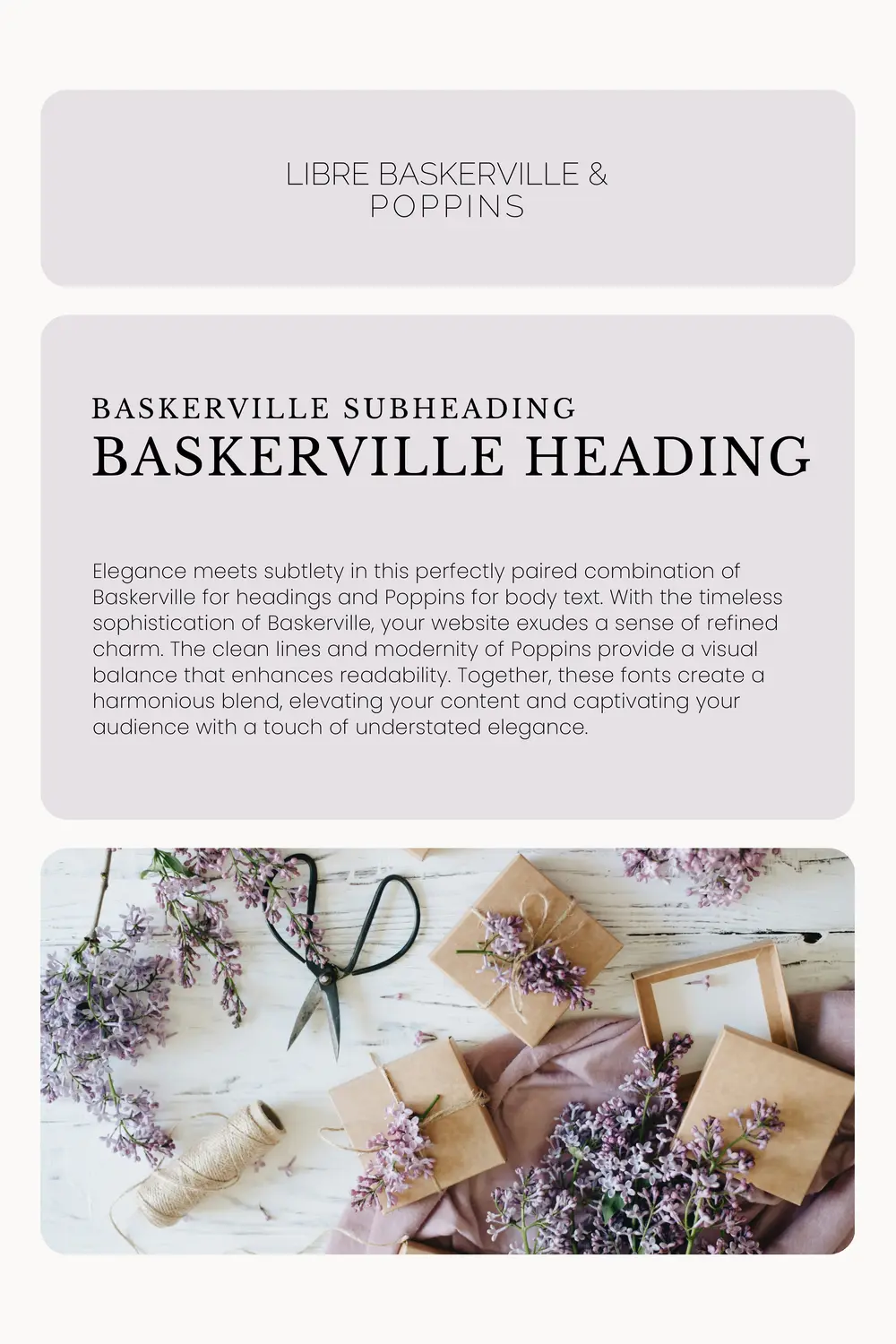
Libre Baskerville (heading) & Poppins (body): Classic Elegance Meets Sleek Sophistication
Immerse yourself in the enchanting combination of Libre Baskerville for headings and Poppins for body text. The timeless elegance of Baskerville radiates refined charm, while the clean lines and contemporary feel of Poppins provide visual balance and enhance readability. Together, these fonts form a harmonious blend that elevates your content, captivating your audience with a touch of understated elegance.
- Independent Publisher or Small Press: Combines traditional typography with a modern twist, suitable for innovative publishing projects.
- Career Coach for Creatives: Offers a balanced mix of professionalism and creativity, appealing to artists, writers, and designers.
- Herbalist or Holistic Health Blogger: A perfect choice for those who value tradition and natural wellness, providing content in an easy-to-digest format.
- Vintage Goods Curator: For those with a business rooted in history and nostalgia, this blend of old and new brings a unique charm to online shops or blogs.
- A health and fitness blog offering valuable tips and resources for maintaining a healthy lifestyle on a budget.
Consider these examples of solo businesses that could benefit from this elegant font pairing to enhance their brand motif:
Libre Baskerville (heading) & Poppins (body): Classic Elegance Meets Sleek Sophistication
Didact Gothic (heading) & Raleway (body): Embracing Modern Minimalism with an Edge
Embrace modern minimalism and evoke a sense of elegance, subtlety, and warmth with the dynamic font pairing of Didact Gothic for headings and Raleway for body text. Didact Gothic’s sleek and minimalist appeal brings a modern edge to your website, exuding sophistication and asserting a contemporary aesthetic. Complementing this, Raleway’s clean lines add a touch of warmth and grace, enhancing readability while maintaining a modern and minimalist vibe. Together, these fonts effortlessly capture attention, conveying a sense of refinement and creating a visually pleasing experience for your audience.

- Tech Blogger or Reviewer: Modern and clean, this pairing works well for professionals focused on the latest in technology and gadgets.
- Fitness Coach Specialising in Remote Workouts: Appeals to modern health-conscious audiences with an approachable and fresh look.
- Minimalist Lifestyle Consultant: The sleek and simple style mirrors the essence of minimalism, perfect for advisors helping clients declutter their lives.
- Digital Marketing Freelancer: Conveys information clearly and efficiently, essential for professionals in the fast-paced world of online marketing.
- A virtual assistant service offering flexible and cost-effective administrative support to busy entrepreneurs.
Consider these examples of solo businesses that could benefit from this elegant font pairing to enhance their brand motif:
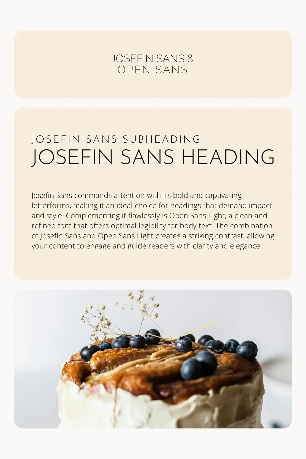
Josefin Sans (heading) & Open Sans (body): Bold and Progressive Pairing for an Alluring Impact
Command attention and make a bold statement with the captivating pairing of Josefin Sans for headings and Open Sans Light for body text. Josefin Sans with its pronounced letterforms exudes boldness and captivates the eye, making it a perfect choice for headings that demand impact and style. Complementing it flawlessly is Open Sans Light, a clean and refined font that offers optimal legibility for body text. The combination of Josefin Sans and Open Sans Light creates a striking contrast, allowing your content to engage and guide readers with clarity and elegance.
- Graphic Designer: Reflects a modern, artistic flair, appealing to clients seeking innovative visual content.
- Music Teacher Offering Online Lessons: Combines elegance with a friendly tone, inviting students of all ages to explore music virtually.
- Event Planner Specialising in Intimate Gatherings: This pairing exudes warmth and sophistication, ideal for planning small, stylish events.
- DIY Craft Blogger: Strikes a balance between a unique, personal touch and easy readability, perfect for sharing creative projects and tutorials.
- A personal branding consultant helping professionals build a strong online presence and communicate their expertise effectively.
Consider these examples of solo businesses that could benefit from this elegant font pairing to enhance their brand motif:
Dosis (heading) & Libre Franklin (body): Expressive and Dynamic Pairing for a Modern Edge
Infuse your website with warmth, grace, and a modern edge using the Dosis and Libre Franklin font pairing. Dosis, with its clean lines and contemporary charm, becomes a captivating heading font, adding versatility and a touch of modernity. Paired with Libre Franklin, a font that exudes warmth and elegance, your body text gains clarity and legibility. Together, this combination harmoniously blends modern sophistication with timeless grace, infusing your website with a sense of refined style.

- Nutritionist or Dietician: Offers a clean and inviting look, which is perfect for professionals promoting healthy living and eating.
- Personal Finance Advisor: Conveys trustworthiness and clarity, key for those offering advice on money management and saving.
- Sustainability Consultant: Reflects modernity and efficiency, appealing to eco-conscious businesses and individuals looking to reduce their environmental impact.
- A fitness trainer providing personalized workout programs and nutritional guidance for individuals seeking to improve their health and fitness.
- A copywriting and content creation service helping solopreneurs craft compelling and engaging content for their online platforms.
Consider these examples of solo businesses that could benefit from this elegant font pairing to enhance their brand motif:
Conclusion
Making a Lasting Impression: How Font Pairings Shape Your Audience’s Perception
Beyond Choosing Fonts: Nurturing Your Solo Business Voice
When we talk about your solo business, it’s not just about what you offer; it’s about how you present it. The fonts you choose speak volumes before a single word gets read. Therefore, start by defining the tone of voice you aim for your brand.
Do you wish to appear professional, creative, or perhaps, comforting? Once you’ve pinned that down, select a font pairing that enhances this perception. Elegant font combinations for solo businesses are not just about aesthetics; they are about creating a dialogue with your audience.
Remember, the right font pairing can make your message not just seen, but felt.
Selecting the perfect font pairings for solopreneurs goes beyond the initial choice. It’s about creating a consistent experience across all platforms where your brand has a presence. Websites, business cards, social media posts—all these touchpoints should echo the same voice.
This is where the principle of ‘less is more’ truly shines. Begin with choosing one font for your headings and another for your body text. This simplicity ensures that your message remains clear and your brand identity cohesive. Additionally, it allows your audience to easily recognize you, no matter where they see your content.
Always remember, in the realm of building a solo business voice, consistency is your ally.
You might like:
Go back to the resource page
Want to learn more? Check out recommended resources
Company of One
by Paul Jarvis
“Company of One” champions the small-is-beautiful ideology. Paul Jarvis praises the merits of staying solo. Ideal for authentic solo business builders seeking sustainable growth.
Small Giants: Companies That Choose to Be Great Instead of Big
by Bo Burlingham, Sean Pratt, Gildan Media
“Small Giants” champions businesses prioritising quality over size. Bo Burlingham showcases companies excelling in authenticity. Ideal for solo entrepreneurs valuing genuine growth.