Architect Website Fonts: Free Google Font Pairings
Introduction
Crafting Your Digital Identity: Architect Website Fonts
In the vast digital landscape, web design is the silent language through which a brand speaks to its audience. For architects transitioning to or enhancing their web presence, selecting the right fonts is akin to selecting the right materials for a structure.
Fonts convey the personality of the architect’s brand – sophisticated, welcoming, innovative, or timeless. Understandably, the font pairing process is pivotal, but it doesn’t have to be daunting, especially when you know where to look.
Typefaces are the visual component of the written word. They influence how we perceive information and, in the context of your website, can dictate whether a visitor stays or goes. Understanding the different roles each typeface plays within a brand is the first step to picking the perfect pair.
Here I break down the best free font pairings for architects, ensuring that design integrity remains intact without compromising on a compelling reading experience.
Table of post content
Let’s explore the various types of architect website fonts. My overview is divided into different types of architect websites, their driving motifs, and free font pairings that help reflect these styles.
Free font pairings for Residential Architects - Comfort motif
Comfort Motif: Creating Welcoming Spaces
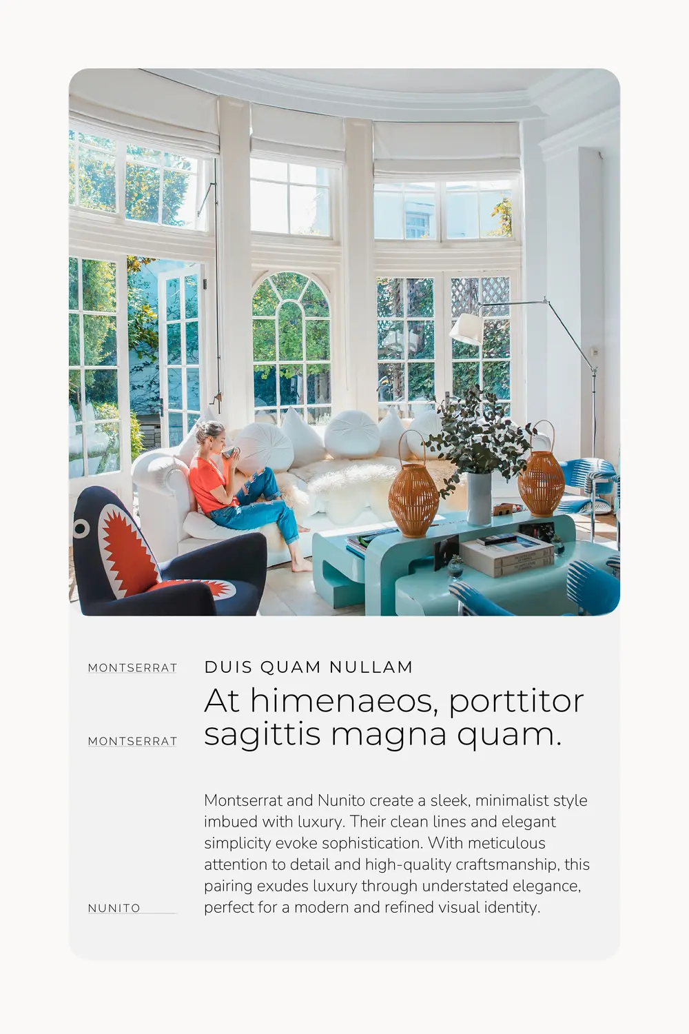
For architects drawn to the comfort motif, the focus lies on crafting spaces that exude warmth and hospitality, embracing visitors like old friends. When selecting font pairings for this motif, aim for a style that feels like a warm handshake – approachable and inviting.
Emphasizing earthy tones, soft lines, and natural materials, these fonts mirror the cozy essence of a home. The branding elements reflect a sense of belonging, featuring imagery of inviting spaces, gentle lighting, and comfortable furnishings. Logos often incorporate rounded edges and warm hues, while websites showcase welcoming text and user-friendly layouts.
This cohesive visual narrative assures clients of more than just architectural brilliance; it promises them a haven of comfort and familiarity.


Free font pairings for Residential Architects - Elegance motif
Elegance Motif: Channelling Sophistication
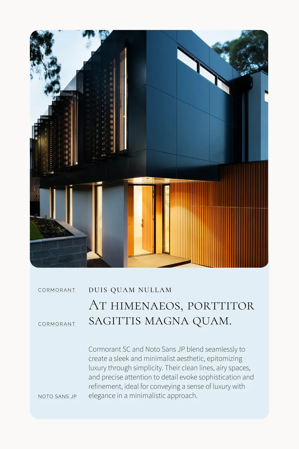
On the other hand, the elegance motif embodies refined taste and subtle luxury, appealing to clients seeking a touch of sophistication in their architectural projects.
A restrained color palette, often featuring monochromatic or muted tones, is elegantly accented with hints of metallics like gold or silver for a dash of opulence. Fonts in this style are sleek and minimalistic, adhering to the principle that less is more when conveying luxury.
Carefully curated imagery showcases clean lines, beautifully illuminated spaces, and a meticulous focus on high-quality materials and intricate details. The overall brand identity radiates exclusivity and bespoke design, catering to a discerning clientele with a refined eye for elegance.

Free font pairings for Interior Architects - Form-Function motif
Form-Function Focused Interior Architects
When it comes to interior architects who prioritize the seamless integration of form and function, their visual identity reflects sleek and utilitarian design principles. Clean lines, minimalist color schemes, and a focus on spatial efficiency define their brand persona.
Neutral color palettes allow the design solutions to take center stage. Logos and websites feature geometric shapes and often employ a sans-serif font, conveying modernity and simplicity.
Carefully curated imagery showcases spaces that are beautifully designed yet highly functional, highlighting the architect’s ability to create environments that enhance everyday living.

Free font pairings for Interior Architects - Timeless Appeal motif
Timeless Appeal Focused Interior Architects
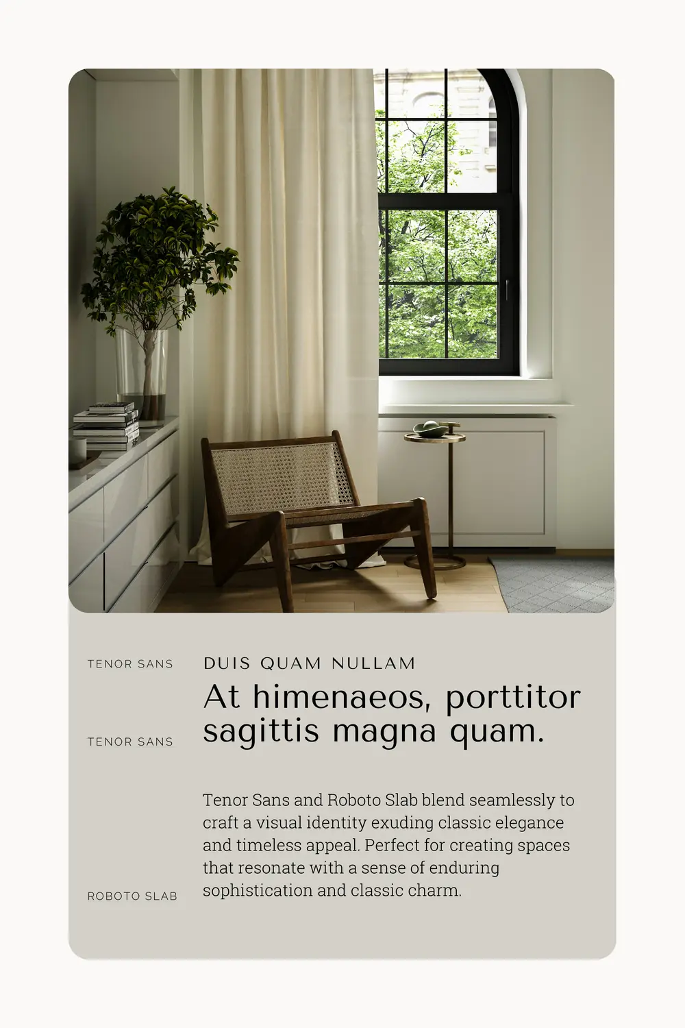
Interior architects dedicated to creating spaces with timeless appeal embrace a visual identity that exudes classic elegance and enduring style. Their branding evokes a sense of tradition and craftsmanship, with a rich and sophisticated color palette. Deep blues, burgundy, or forest green are often complemented by gold or silver accents for a touch of luxury. Serif fonts convey stability and time-honored design principles. The imagery they use portrays spaces that balance trend-resistance with contemporary comfort, emphasizing materials and designs that have stood the test of time. This visual approach appeals to clients seeking spaces that promise longevity in both style and functionality.

Free font pairings for Landscape Architects - Nature-Inspired motif
Nature-Inspired Landscape Architects
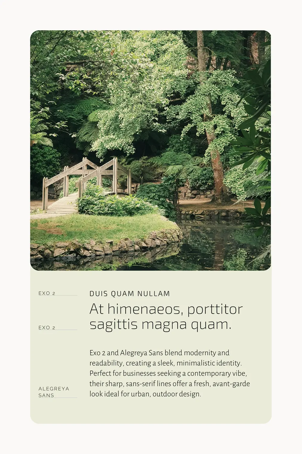
Nature-inspired landscape architects embrace an organic and earthy visual identity, seeking to harmonize built environments with the natural world. This style is characterized by the use of natural textures, earth-tone color palettes, and imagery that evokes the serenity of the outdoors.
Typography reflects the fluidity and irregularity found in nature, providing a unique and captivating visual appeal. Logos and branding materials often incorporate motifs of leaves, water, stone, and wood, symbolizing a commitment to sustainability and ecological sensitivity.
By weaving together these elements, nature-inspired landscape architects create a visual narrative that emphasizes connectivity to the natural environment, captivating clients who value eco-friendly and sustainable design principles.


Free font pairings for Landscape Architects - Modern motif
Clean & Modern Landscape Architects
For landscape architects with a clean and modern motif, the visual identity is sleek, minimalistic, and focused on form and function. This style embraces a monochromatic or restrained color scheme, portraying sophistication and timeless elegance.
Typography features sharp lines and favors sans-serif fonts, providing readability and a contemporary aesthetic. Logos and branding elements incorporate geometric shapes and lines, showcasing precision and order in design. Imagery is thoughtfully curated to highlight the architectural aspects of landscape design, emphasizing innovative use of space and modern materials.
This visual identity appeals to clients seeking outdoor spaces that complement urban environments and contemporary lifestyles, offering a fresh and avant-garde approach to landscape design.

Conclusion
Architects of every stripe have the opportunity to elevate their online presence with carefully chosen combinations of free fonts. The digital realm is your blueprint.
Just as you meticulously plan a structure to marry form and function, the font selections for your website are part of your unique design story.
With the right pairings, you command the reader’s attention while visually reinforcing your brand identity. It’s through these subtle artistic choices that your online portfolio can set you apart as a master designer in your field. Start crafting your digital masterpiece today—with fonts that represent your architectural genius.
You might like:
Go back to the resource page
Want to learn more? Check out recommended resources
Designing Brand Identity: An Essential Guide for the Whole Branding Team
by Alina Wheeler
This book is a comprehensive guide to creating, building, and maintaining a strong brand. It covers the importance of a cohesive brand identity across various mediums and gives practical advice on selecting color palettes, typography, and imagery. Its rich collection of case studies from around the world provides inspiration and insight, making it an invaluable resource for solopreneurs intent on developing a unique and compelling online presence.
Building a StoryBrand: Clarify Your Message So Customers Will Listen
by Donald Miller
While not exclusively about visual identity, this book is crucial for understanding how to communicate your brand’s message effectively. Miller introduces the StoryBrand framework, which helps solopreneurs craft clear and engaging narratives about their brand. This book is particularly useful when designing marketing collaterals and online content, ensuring that all visual elements align with the brand’s core message.