Website Color Palette – Crafting Visual Identity
Introduction
Finding Inspiration in a Colorful World
The Essence of Choosing a Website Color Palette
Navigating the colorful world of social media for website color palette inspirations can often lead to disappointment when trying to apply those vibrant palettes to your solo business’s visual identity.
The key lies in understanding that a coherent color palette follows certain guidelines to effectively communicate your solo business’s motif and connect with your audience. This is because a visual identity requires some rules to follow to express the tone of your solo business voice and start a dialogue with your desired client. Let’s dive into it.
Choosing the right website color palette for your solo business is crucial. It’s more than just picking colors that appeal to you personally. It’s about what those colors communicate to your audience.
The colors you select for your visual identity should mirror the feelings you want to evoke in your audience. For example, blue evokes feelings of trust and security, making it a popular choice for financial services, whereas green often relates to health and wellness.
By strategically selecting a website color palette, we forge a visual identity not just reflecting our business motif but also resonating deeply with our intended audience.
In crafting the visual identity of your solo business, incorporating personal insights and maintaining an authentic tone are paramount. Engage in a dialogue with your audience by leveraging a chosen color palette that encapsulates your business’s essence. This personal touch fosters a closer connection and elevates your visual identity beyond mere aesthetics, making it a reflection of your unique vision and values.
Table of post content
Designing Your Website Color Palette - Useful Template
Creating a website color palette is more than picking your favorite colors. It’s about crafting a coherent and appealing visual story. Remember, your color palette is a key tool in expressing your brand’s motif. Choose wisely, and watch your visual identity flourish.
You can access my freebie ready for use. All you need is Canva (available for free) and this Canva document for your website color palette creation. Simply copy and start crafting a visual identity for your solo business.
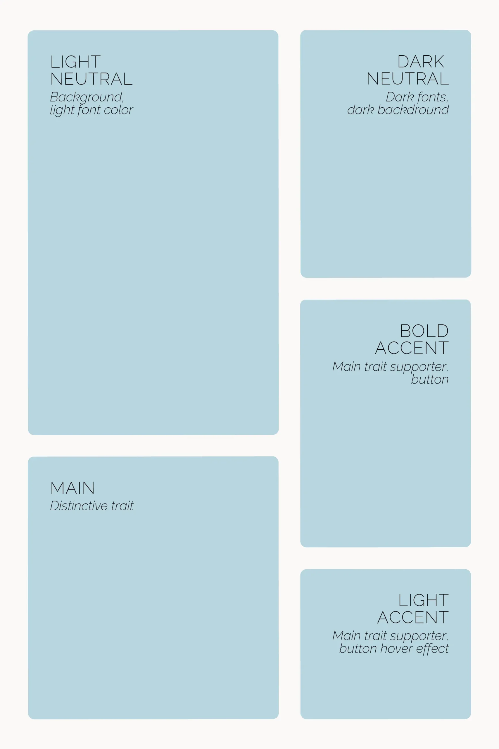
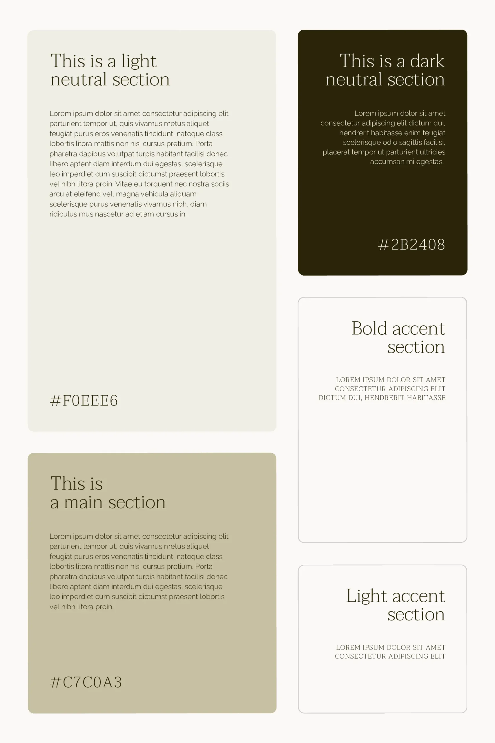
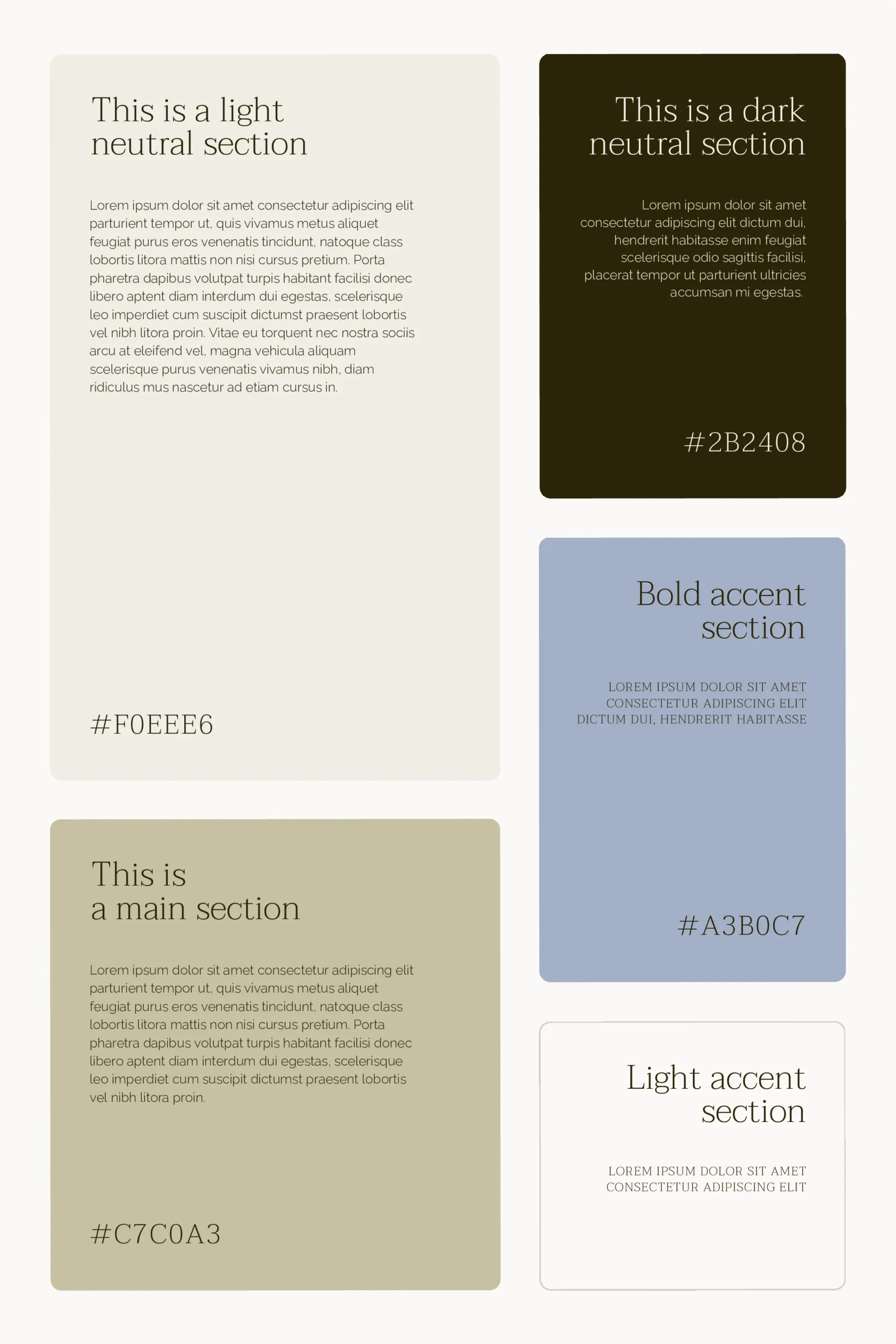
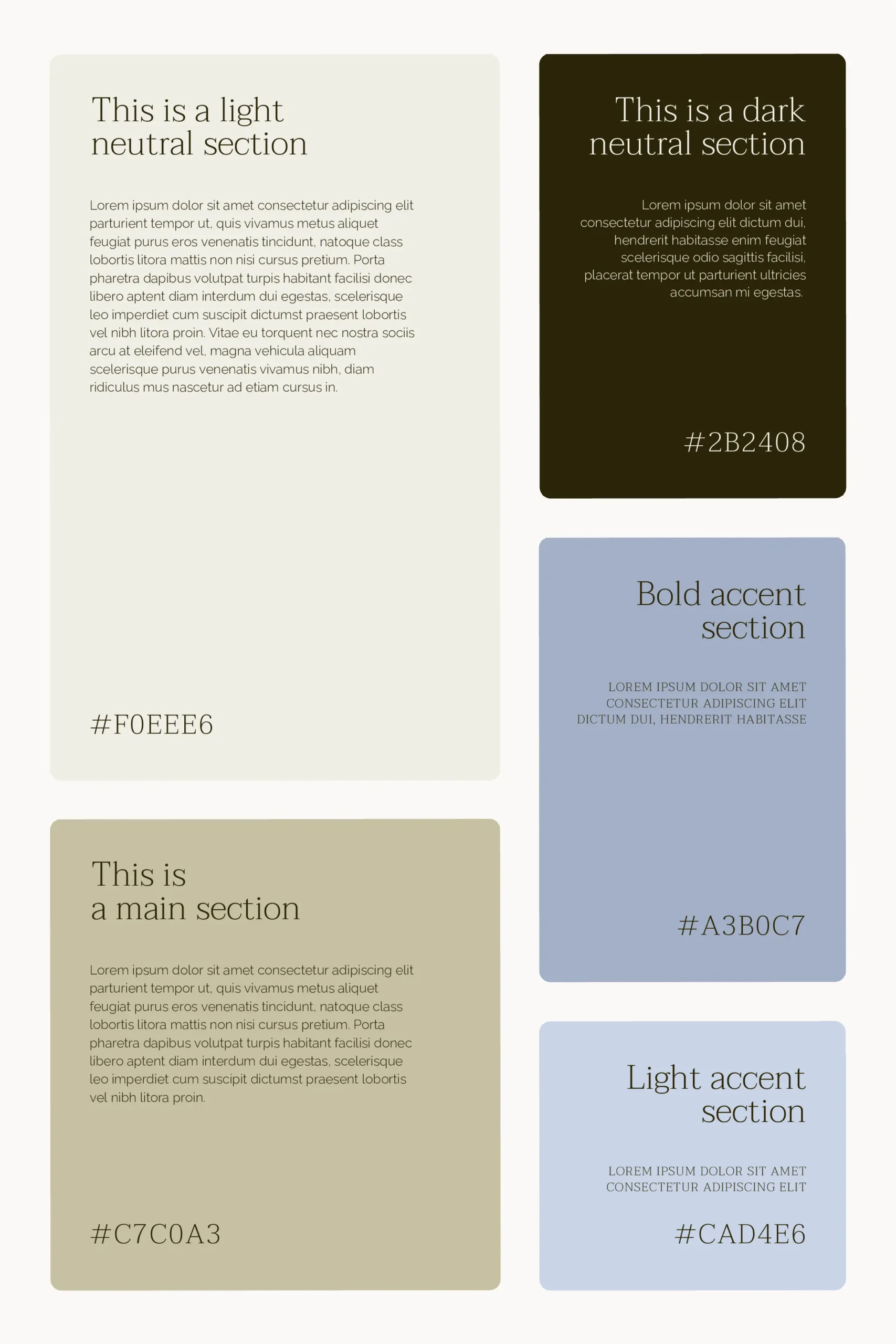
The palette typically includes five color types, each serving a specific role. Refer to the image below for a clearer understanding of color proportion. For instance, ‘Light neutral’ is often used, while ‘Light Accent’ is used sparingly.
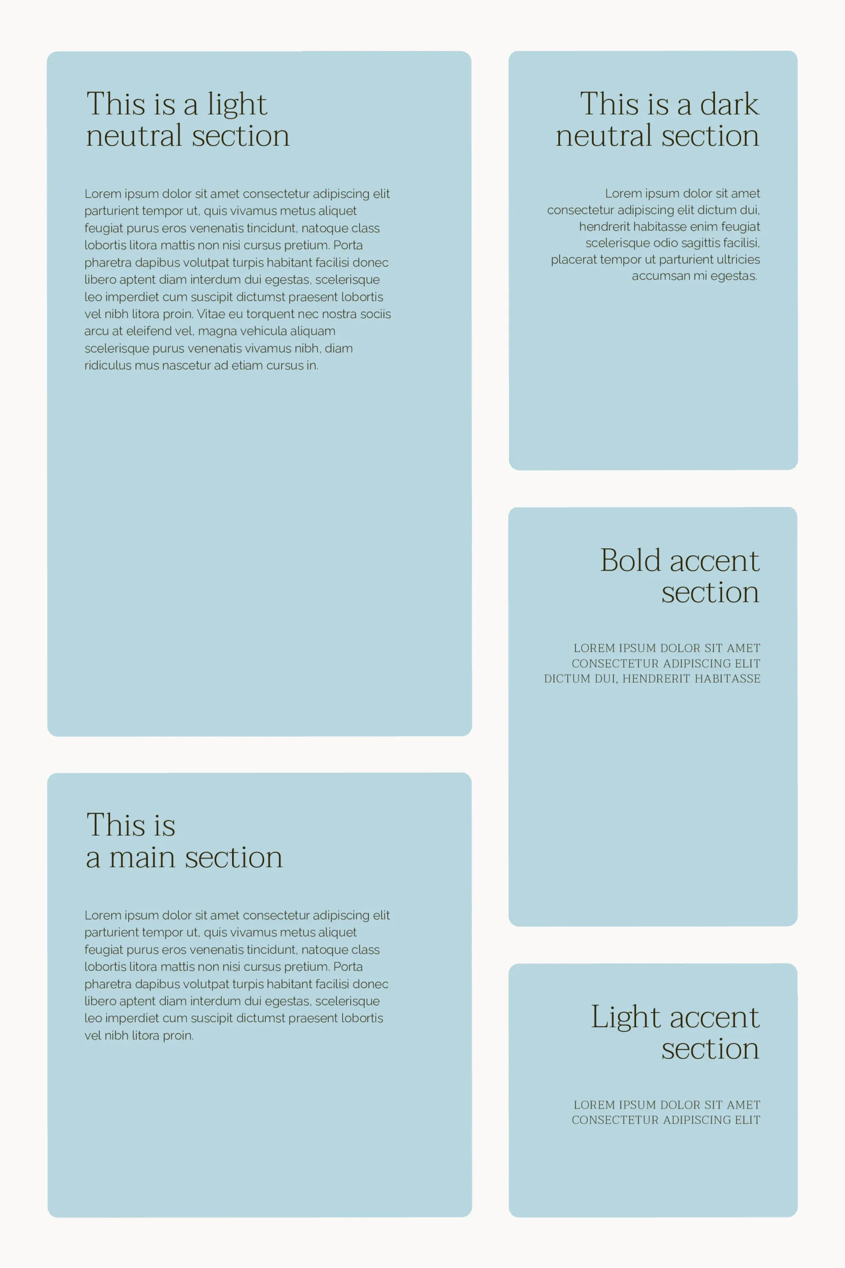
When refining your website color palette, consider its harmony with content. Including ‘Ipsum Lorem’ text can help assess color-text compatibility seamlessly. Prioritize a color scheme that complements and enhances your content effectively.
Designing Your Website Color Palette - 5 colors and their roles
The Role of Light Neutrals in Your Visual Identity
Light neutrals play a crucial role in our website color palette. They’re perfect for backgrounds and light font colors.
Such shades bring a sense of calm and openness to your design. They make your space feel larger, airier.
Think of them as the canvas upon which your brand’s story unfolds. By choosing the right light neutrals, we set a balanced stage for our bold colors to shine.
The Importance of Dark Neutrals for Contrast and Legibility
On the other hand, dark neutrals are indispensable. They provide contrast and enhance legibility.
These shades are your go-to for dark font colors and backgrounds.
They bring depth and sophistication to your visual identity.
Dark neutrals ensure that your text pops, making your message clear. They are not just practical; they add an element of elegance to your design.
Choosing a Bold Primary Color as Your Visual Identity
Your bold primary color is the heart of your color palette. It’s the main identifier for your solo business.
This color should stand out and communicate your brand’s motif. It expresses the energy and passion behind your work.
When selecting your bold primary, consider its emotional impact. This color will be the most memorable aspect of your visual identity.
Integrating Bold Accents for Visual Interest
Furthermore, bold accents are essential. They enhance the primary color.
Ideally used for accents or buttons, these colors add visual interest and highlight key areas.
Balancing your bold primary with carefully chosen accents ensures your design is dynamic.
Remember, these colors should complement, not compete. They guide your audience’s attention to where it’s most needed.
Utilizing Light Accents for User Interaction
Lastly, light accents have a unique role.
They complement the primary color. Suitable for buttons or hover effects, they improve user interaction.
These accents invite your audience to engage, explore, and connect with your content.
By cleverly using light accents, you create a visual identity that’s not only beautiful but also functional.
A Step-by-step Guide on a Website Color Palette Crafting
1st step
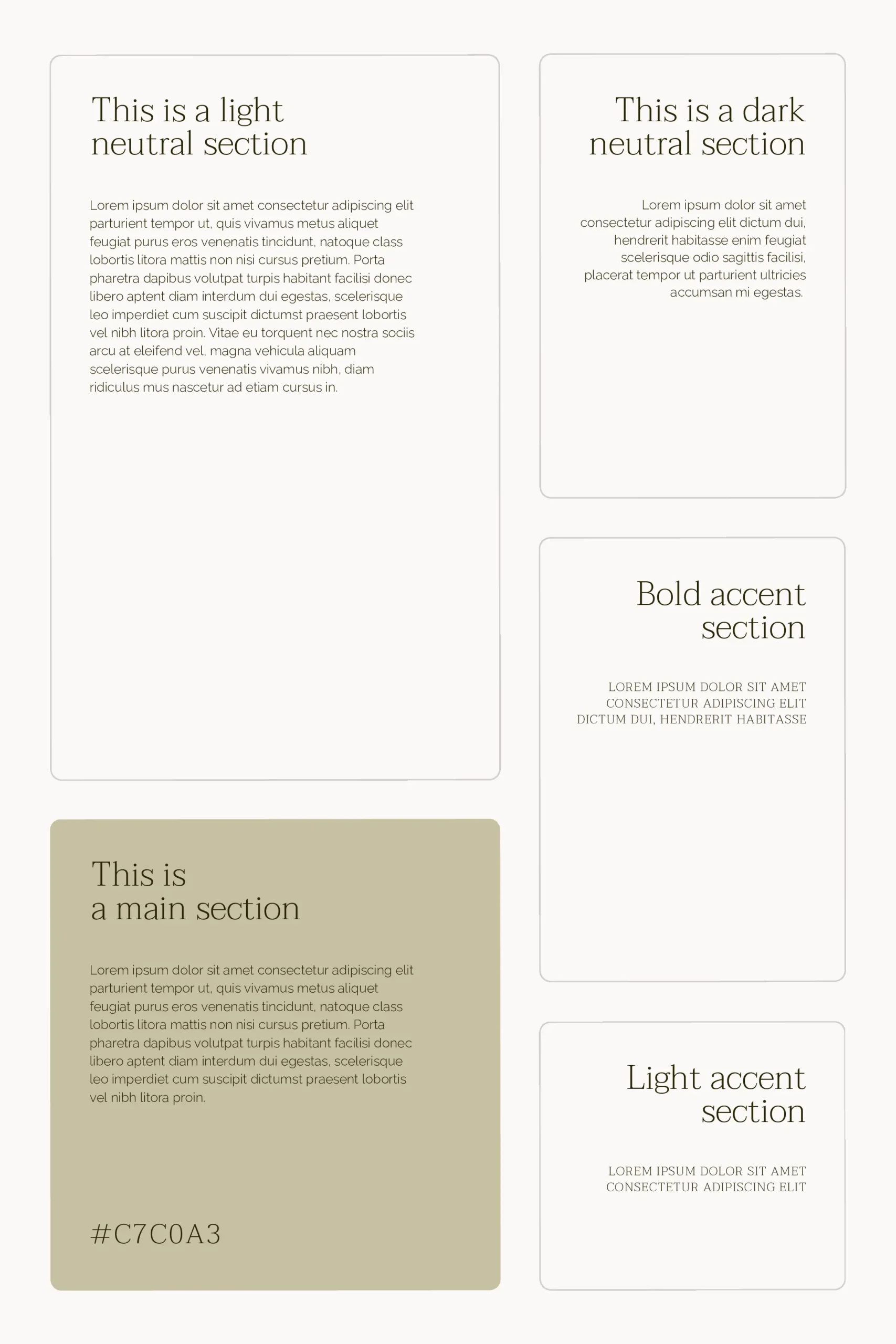
Choose your ‘Main’ color, the cornerstone of your website color palette.
This color is often preselected as it resonates with the unique identity of your business.
The primary goal of crafting a website color palette is to enhance and complement this ‘Main’ color with the other four, allowing it to shine beautifully.
In this case, I use the #C7C0A3 HEX color code as a ‘Main’ color.
2nd step
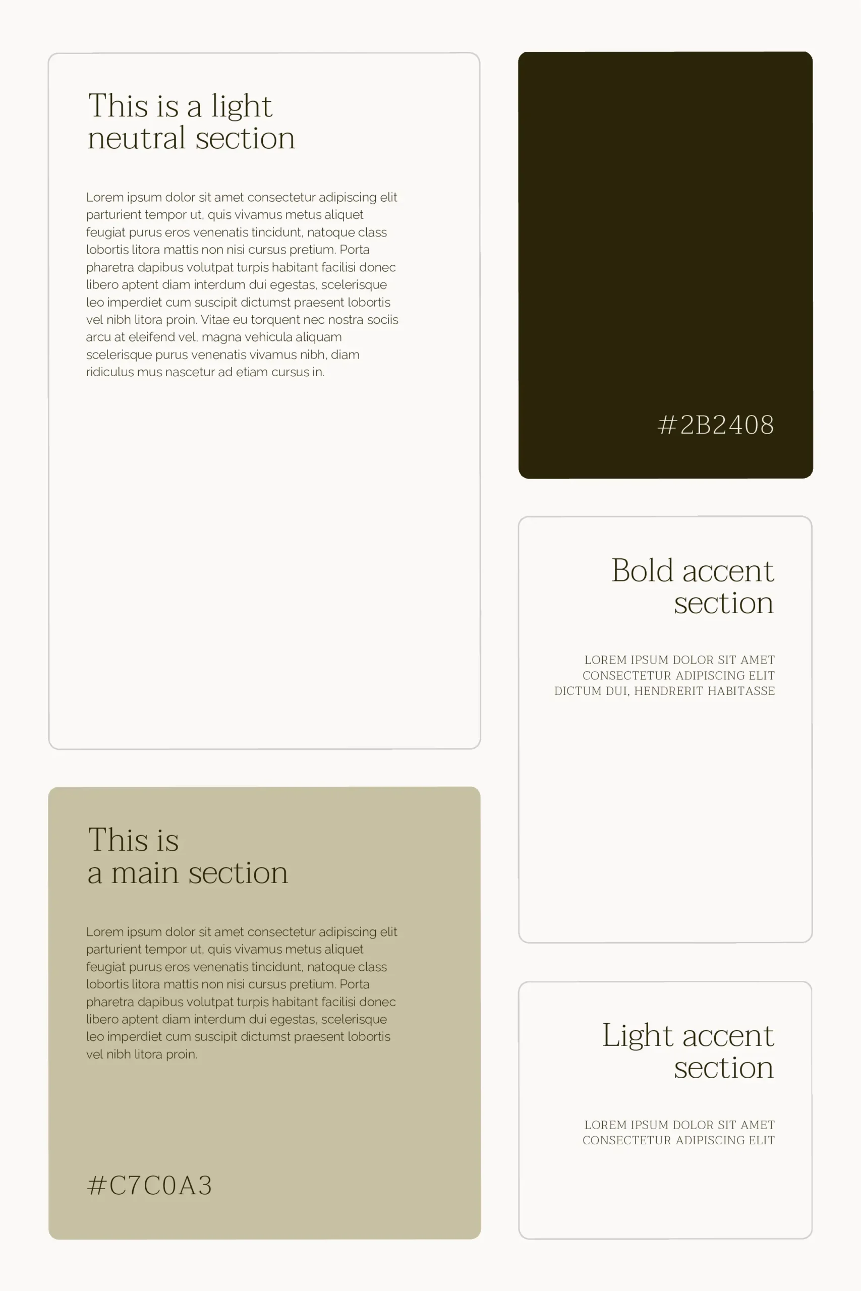
The next step is to choose the ‘Dark Neutral’ color.
Utilize Adobe Color by inputting the HEX color code of your Main color as a base color. Then choose a monochromatic scheme for ‘Color Harmony.’
Ensure the dark neutral shade is the deepest. Before finalizing, assess the text contrast ratio and adjust the brightness if needed to improve visibility.
In this case, I decreased saturation to get #2B2408 color called Baker’s Chocolate.
3rd step
Next, we proceed with selecting the ‘Light Neutral’ color, a light variation of your ‘Main’ color.
Keep in mind that the ‘Light Neutral’ color serves a dual purpose—it acts as a background and text color for darker backgrounds like the ‘Dark Neutral.’
Opt for a light shade with a touch of grey. To choose this color, go to the Adobe Color and input the HEX color code of your Main color. Then select the shades option in ‘Color Harmony.’
Your ‘Light Neutral’ shade should be the lightest. Adjust saturation downward and brightness upward before finalizing.
Confirm the selection by applying this color as the font color for the ‘Dark Neutral’ section.
I needed to increase brightness and decrease saturation to get my final ‘Light neutral’. As a result, I got #F0EEE6 color.
4th step
Next, move on to creating the ‘Accent’ colors, beginning with the ‘Bold’ accent.
This color should complement your ‘Main’ color.
Once again, utilize Adobe Color by inputting the HEX color code of your Main color and choosing ‘split complementary’ scheme in the ‘Color Harmony’ section.
Although the ‘complementary’ option is available, ‘split complementary’ often offers a more appealing selection.
You may find that little to no adjustments are necessary.
That was my case as well. I did not adjust Adobe’s proposal and applied #A3B0C7 color.
5th step
Finally, the last step involves crafting the ‘Light Accent’ color.
To select this color, repeat the process outlined in step 3, but this time, use the ‘Bold Accent’ color as the base.
I typically enhance the color by adding subtle grey tones through decreasing saturation.
And in this case I used #CAD4E6 color.
Conclusion
Colors are the silent ambassadors of your brand. They spark emotions and shape perceptions.
Selecting your website color palette, therefore, is a deeply personal yet strategic decision. It breathes life into your visual identity, making it relatable and memorable.
This choice is pivotal in building a visual storyline that aligns with your solo business’s motif. The endeavor to finalize your website color palette is a significant step in defining your brand’s visual identity.
This guide aims to inspire you to uncover a palette that not only enhances your solo business motif’s appearance but also looks great on your website.
You might like:
Go back to the resource page
Want to learn more? Check out recommended resources
Designing Brand Identity: An Essential Guide for the Whole Branding Team
by Alina Wheeler
This book is a comprehensive guide to creating, building, and maintaining a strong brand. It covers the importance of a cohesive brand identity across various mediums and gives practical advice on selecting color palettes, typography, and imagery. Its rich collection of case studies from around the world provides inspiration and insight, making it an invaluable resource for solopreneurs intent on developing a unique and compelling online presence.
Building a StoryBrand: Clarify Your Message So Customers Will Listen
by Donald Miller
While not exclusively about visual identity, this book is crucial for understanding how to communicate your brand’s message effectively. Miller introduces the StoryBrand framework, which helps solopreneurs craft clear and engaging narratives about their brand. This book is particularly useful when designing marketing collaterals and online content, ensuring that all visual elements align with the brand’s core message.